
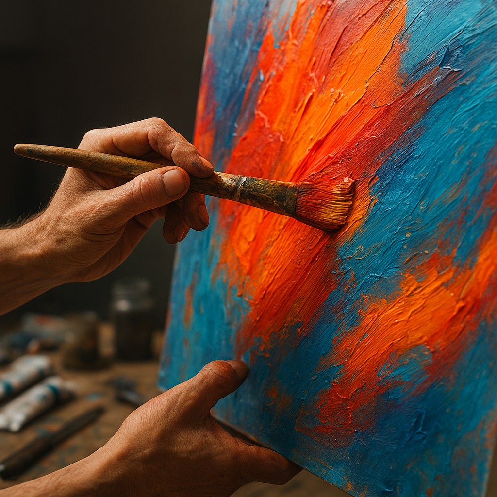
Ever stood in front of an abstract painting and felt something you couldn’t quite explain? That’s not accidental. The artist behind that canvas made deliberate color choices designed to bypass your logical brain and speak directly to your emotions. Color theory isn’t just about which hues look pretty together—it’s a sophisticated language that abstract artists use to create visceral, emotional experiences. Whether you’re a collector trying to understand why certain pieces move you, or an artist looking to deepen your practice, understanding how color creates emotional resonance will transform how you see abstract art.
The Science Behind Color and Emotion
The relationship between colors and emotions isn’t just artistic intuition—it’s rooted in both biology and culture. When light hits our retinas, it triggers responses in the hypothalamus, the part of our brain that regulates hormones, body temperature, and yes, emotional responses. This is why a red room can literally increase your heart rate while a blue one might lower your blood pressure.
Research from the University of Rochester found that exposure to red can impair performance on achievement tasks because our brains associate it with danger and avoidance. Meanwhile, a 2015 study published in the journal Emotion showed that people across 30 countries consistently associated certain colors with specific emotions—red with anger and love, black with sadness, and yellow with joy.
Abstract artists exploit these neurological and psychological responses. Without recognizable subjects to anchor meaning, color becomes the primary vehicle for emotional communication. Mark Rothko understood this intimately. His massive color field paintings weren’t just aesthetic choices—they were emotional environments. Standing before a Rothko isn’t about seeing; it’s about feeling the vibration between colors.
What Different Colors Really Communicate in Abstract Art
While cultural context matters, certain color-emotion connections appear remarkably consistent across abstract art. Understanding these associations helps decode what a palette is really saying.
Warm Colors: Energy, Passion, and Urgency
Reds, oranges, and yellows advance visually—they seem to come toward you. In abstract art, these colors create immediacy and intensity. Kandinsky believed yellow disturbed people, creating excitement, while red provided a sense of immense, almost cruel strength.
- Red: Passion, danger, urgency, or vitality depending on context and shade
- Orange: Enthusiasm, creativity, warmth without red’s aggression
- Yellow: Optimism and energy, but also anxiety in acidic or neon tones
Helen Frankenthaler’s soak-stain technique with warm oranges and reds creates landscapes of emotion rather than place—viewers report feeling energized, sometimes overwhelmed, by their intensity.
Cool Colors: Contemplation, Distance, and Calm
Blues, greens, and purples recede, creating psychological and visual space. They’re the colors of distance—both physical and emotional.
- Blue: Tranquility, melancholy, spirituality, or coldness
- Green: Growth, harmony, renewal, or sometimes envy and sickness
- Purple: Luxury, mystery, spirituality, but also mourning in some contexts
Gerhard Richter’s blue abstracts feel entirely different from his red series, even when using similar compositional techniques. The blue works invite contemplation; the red ones demand response.
Neutrals and Earth Tones: Grounding and Sophistication
Browns, grays, blacks, and whites create space for other colors or stand powerfully alone. Agnes Martin’s subtle grids using barely-there colors create meditative experiences precisely because they whisper rather than shout.
How to Apply Color Theory in Abstract Painting
Understanding color psychology is one thing; applying it effectively in your work is another. Here’s how successful abstract artists approach palette selection for maximum emotional impact.
Start with Emotional Intent, Not Color Names
Before squeezing paint onto your palette, identify the emotional response you want to create. Are you exploring grief? Joy? Tension? Serenity? Write it down. This becomes your North Star for every color decision.
Then work backward. If you’re exploring grief, you might traditionally reach for grays and blacks. But what if you explored grief through the lens of memory—perhaps warm ochres that feel both comforting and distant? The most powerful abstract art often subverts expectations while still creating authentic emotional experiences.
Master Color Temperature Relationships
Emotional complexity in abstract art often comes from temperature contrast. A predominantly cool blue painting with strategic warm orange accents creates visual and emotional tension. The warm areas become focal points—emotional punctuation marks.
Try this exercise: Create three small abstract studies using the same composition. Make one entirely warm, one entirely cool, and one with an 80/20 temperature split. You’ll immediately see how the 80/20 version creates more visual interest and emotional depth.
Use Saturation Strategically
Highly saturated colors scream for attention and energy. Desaturated, muted tones create sophistication and calm. Many emerging abstract artists make the mistake of using fully saturated colors everywhere—it’s like shouting every word of a sentence.
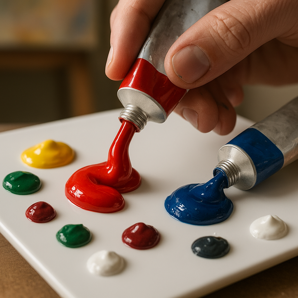
Instead, choose one or two areas for high saturation and let the rest of your palette support those moments. Joan Mitchell’s paintings often feature a cacophony of color, but look closely—she varies saturation masterfully, giving your eye places to rest amid the energy.
The Four Psychological Colors and Their Impact
Color psychology identifies four primary psychological colors: red, blue, yellow, and green. These correspond to fundamental emotional and physical responses that abstract artists leverage constantly.
Red (Physical): Relates to the body and physical world. It triggers physical responses—increased heart rate, appetite stimulation, heightened awareness. In abstract art, red demands attention and creates urgency.
Blue (Mental): Affects us mentally rather than physically. It’s the color of intellect, communication, and trust. Blue abstracts feel cerebral and calm, encouraging contemplation rather than action.
Yellow (Emotional): Stimulates emotions, optimism, and self-esteem. But it’s delicate—the wrong shade of yellow or too much of it creates anxiety and fear. Yellow in abstract art walks a fine line between joy and unease.
Green (Balance): Sits at the center of the spectrum, creating balance and harmony. Green abstracts feel restorative and natural, though murky greens can evoke decay or stagnation.
Understanding these four psychological anchors helps you build palettes that work on multiple emotional levels. A painting might be predominantly blue (mental, calm) with yellow accents (emotional, optimistic) to create a feeling of hopeful contemplation.
Decoding Complex Palettes: Beyond Individual Colors
While individual colors carry meaning, the magic of abstract art happens in the relationships between colors. This is where understanding color theory principles becomes crucial.
Complementary Tension
Colors opposite on the color wheel—blue and orange, red and green, yellow and purple—create maximum contrast and vibration. In abstract art, complementary colors create energy and visual excitement, but they can also feel aggressive or uncomfortable.
Willem de Kooning used complementary contrasts to create paintings that feel alive with nervous energy. The colors fight and harmonize simultaneously, keeping your eye moving across the canvas.
Analogous Harmony
Colors adjacent on the wheel—blues, blue-greens, and greens, for instance—create harmonious, restful experiences. Analogous color schemes in abstract art feel unified and peaceful, though they risk monotony without variation in value and saturation.
Monochromatic Subtlety
Working within a single color family using variations in value, saturation, and temperature creates sophisticated, unified works. Monochromatic abstracts rely on texture, value contrast, and subtle shifts to create interest. They’re often the most meditative works, inviting close looking and reflection.
Twenty Colors and Their Meanings in Abstract Contexts
While we’ve covered primary associations, here’s a more nuanced breakdown of how specific hues function emotionally in abstract art:
- Crimson: Intense passion or violence, depending on context
- Scarlet: Boldness, confidence, sometimes danger
- Burgundy: Sophisticated power, controlled intensity
- Coral: Warmth, playfulness, approachability
- Burnt Orange: Autumn, comfort, earthiness
- Tangerine: Vibrancy, youth, energy
- Golden Yellow: Optimism, wisdom, illumination
- Lemon Yellow: Freshness, alertness, sometimes anxiety
- Ochre: History, grounding, ancient wisdom
- Forest Green: Growth, fertility, natural harmony
- Olive: Peace, diplomacy, sometimes stagnation
- Mint: Freshness, newness, lightheartedness
- Turquoise: Communication, clarity, tropical escape
- Sky Blue: Openness, freedom, spirituality
- Navy: Authority, depth, contemplation
- Indigo: Intuition, mystery, inner knowledge
- Lavender: Nostalgia, femininity, softness
- Magenta: Transformation, unconventionality
- Charcoal: Sophistication, mystery, weight
- Ivory: Purity, simplicity, quiet elegance
Remember, these aren’t fixed rules. Context, surrounding colors, cultural background, and personal experience all modulate how we emotionally respond to specific hues.
Cultural Considerations in Color Symbolism
Color meanings aren’t universal. While some responses appear biological—like red’s effect on heart rate—many associations are culturally learned. White signifies purity and weddings in Western cultures but mourning in parts of Asia. Red means luck and prosperity in China but can signal danger or debt in Western contexts.
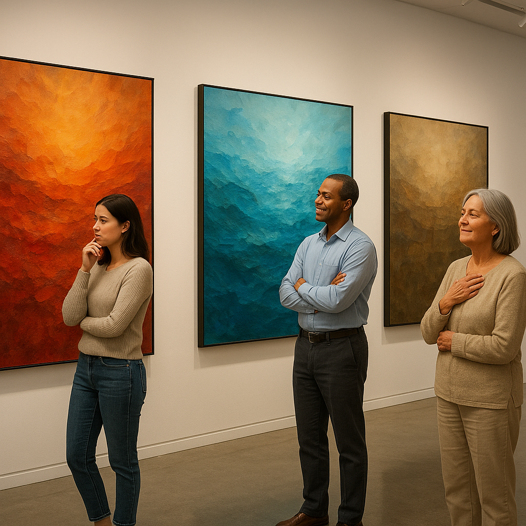
Abstract artists working for international audiences face interesting challenges. A palette that reads as celebratory in one culture might feel somber in another. This isn’t a limitation—it’s an opportunity to create layered works that reveal different meanings to different viewers.
Yayoi Kusama’s use of red polka dots reads differently across cultures, but the visceral, obsessive quality of her repeated patterns transcends specific cultural color codes to create universally affecting experiences.
Creating Emotional Resonance Through Value and Contrast
Hue gets most of the attention, but value—the lightness or darkness of a color—often carries more emotional weight. A high-key painting (predominantly light values) feels airy, optimistic, or ethereal regardless of specific colors used. A low-key work (predominantly dark values) creates drama, mystery, or weight.
Contrast in value creates focal points and directs emotional attention. A predominantly gray painting with one area of deep black and bright white creates visual tension that translates to emotional tension. Your eye goes to the contrast, and your emotions follow.
Consider Pierre Soulages, the master of black. His “Outrenoir” (beyond black) paintings prove that even a single color creates infinite emotional range through value, texture, and light reflection. The emotional resonance comes not from color variety but from the depth and nuance within limitation. This philosophy aligns with subtle visual language that evokes complex feelings through restraint.
Practical Exercises for Developing Your Color Intuition
Reading about color theory only takes you so far. Developing genuine color intuition requires practice:
Emotional color journaling: For one week, create a small color study each day based purely on your emotional state. Don’t overthink it—just choose colors that feel right. At week’s end, look for patterns in your color-emotion connections.
Limited palette challenges: Create the same composition three times using only three colors plus white and black. This forces you to understand how much emotional range exists within constraint.
Color translation: Take a favorite photograph or memory and translate it into an abstract piece using only color—no recognizable forms. This builds your ability to separate emotional content from representation.
Museum studies: Spend time with abstract works in person when possible. Reproductions flatten both color and emotional impact. Note which pieces draw you in and analyze their palettes. What color combinations keep you looking?
Once you’ve explored these individual exercises, consider building a cohesive series that applies these color principles across multiple works to amplify their emotional impact.
Conclusion
Color theory in abstract art isn’t about following rules—it’s about understanding a language sophisticated enough to express what words cannot. The relationship between colors and emotions operates on multiple levels: biological responses hardwired into our nervous systems, psychological associations we’ve absorbed from culture, and personal connections unique to individual experience.
Whether you’re creating abstract art or deepening your appreciation of it, understanding what palettes really communicate transforms the experience. Those seemingly random color choices in successful abstract works are anything but random. They’re carefully orchestrated emotional compositions, using hue, value, saturation, and temperature to create resonance that bypasses rational thought and speaks directly to feeling.
The most powerful abstract art doesn’t just use color—it understands color’s emotional weight and wields it with intention. By mastering these principles, you gain access to abstract art’s true power: the ability to make people feel something profound, even when they can’t articulate exactly why.